Maya Chalee
Graphic Design, Illustration, Art
Do you need a logo, branding, a fully fleshed out campaign or an illustration? I am an artist and graphic design brand strategist who focuses on results for your project. From freelance jobs, small businesses & startups to international corporations, I have helped my clients with an array of design strategies to meet their unique needs. Please take a look at some of my most recent projects and work and hit me up with questions about my work or let me know if you want to collaborate.
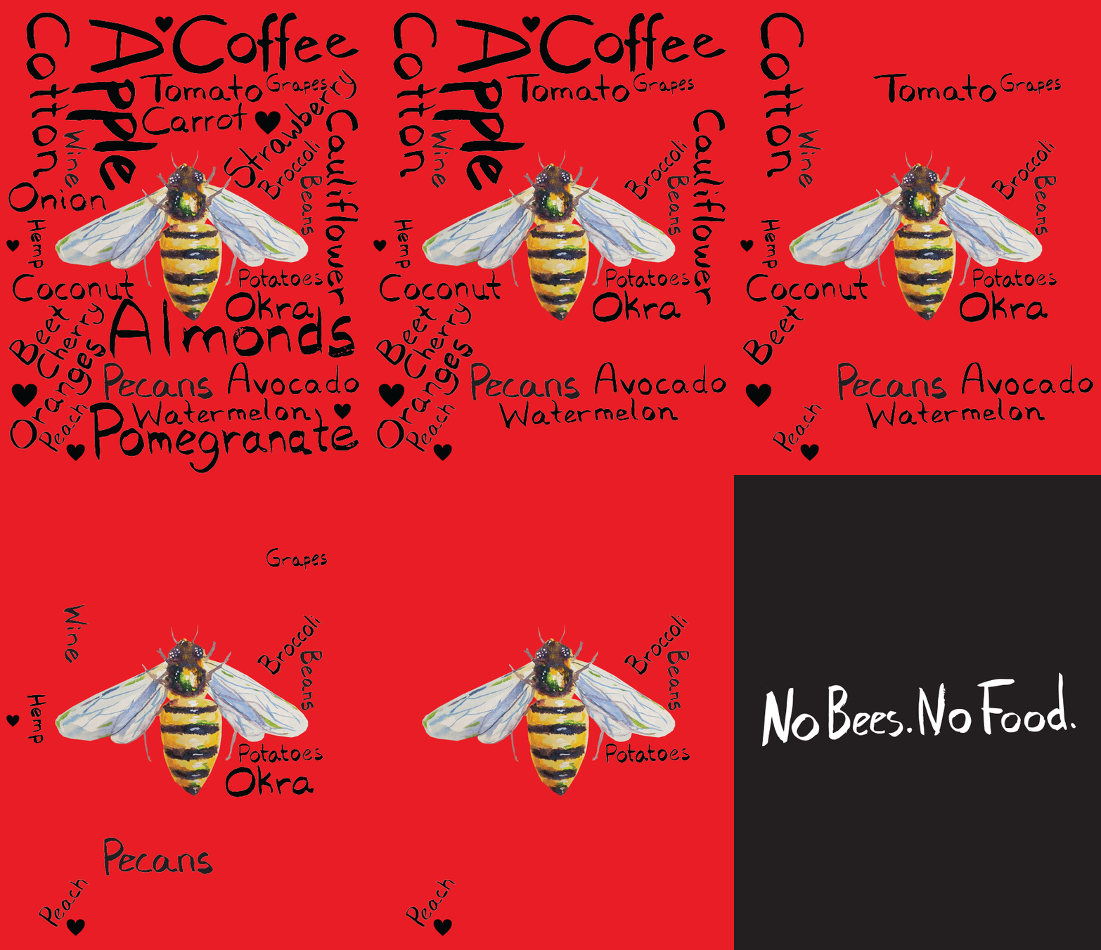
Save the Bees Passion Project
Bees & Our Connection To Food - Spring 2022
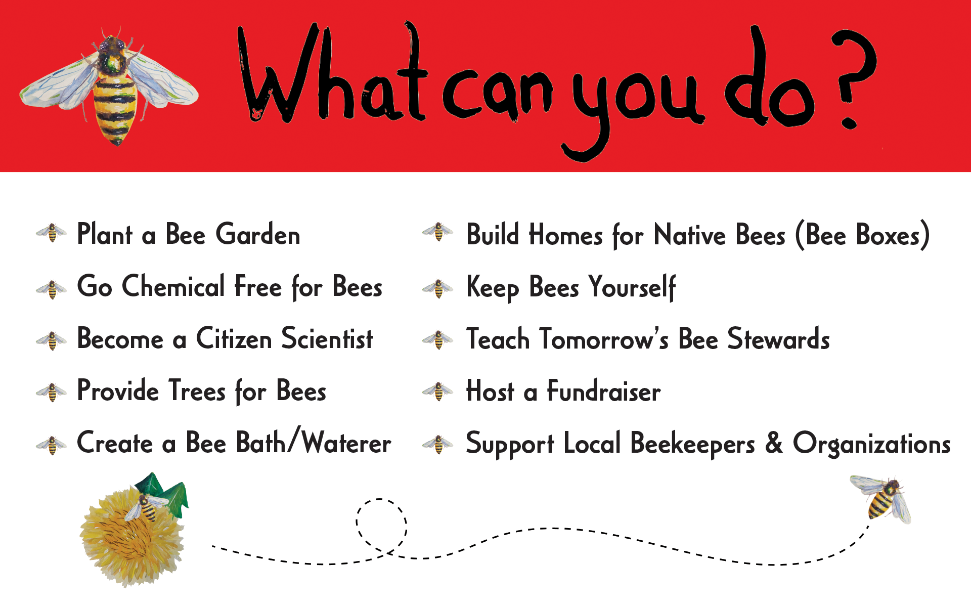
Objective/Audience: To create a bee centric awareness social media campaign, animated bus stop sign and highway billboard.
Creative Rationale: To bring home the absolute importance of bees to our food chain by using bold striking colors and fonts as well as a serious message.
Deliverables: Posters digital & print, billboards, stickers, social media posts.
Save the Bees Bus Poster Mock-Up
Research: The Bee Conservancy | Hagaan Daz Bee Sanctuary
Travis Credit Union
Money Market Awareness Penetration Campaign Q1 2022
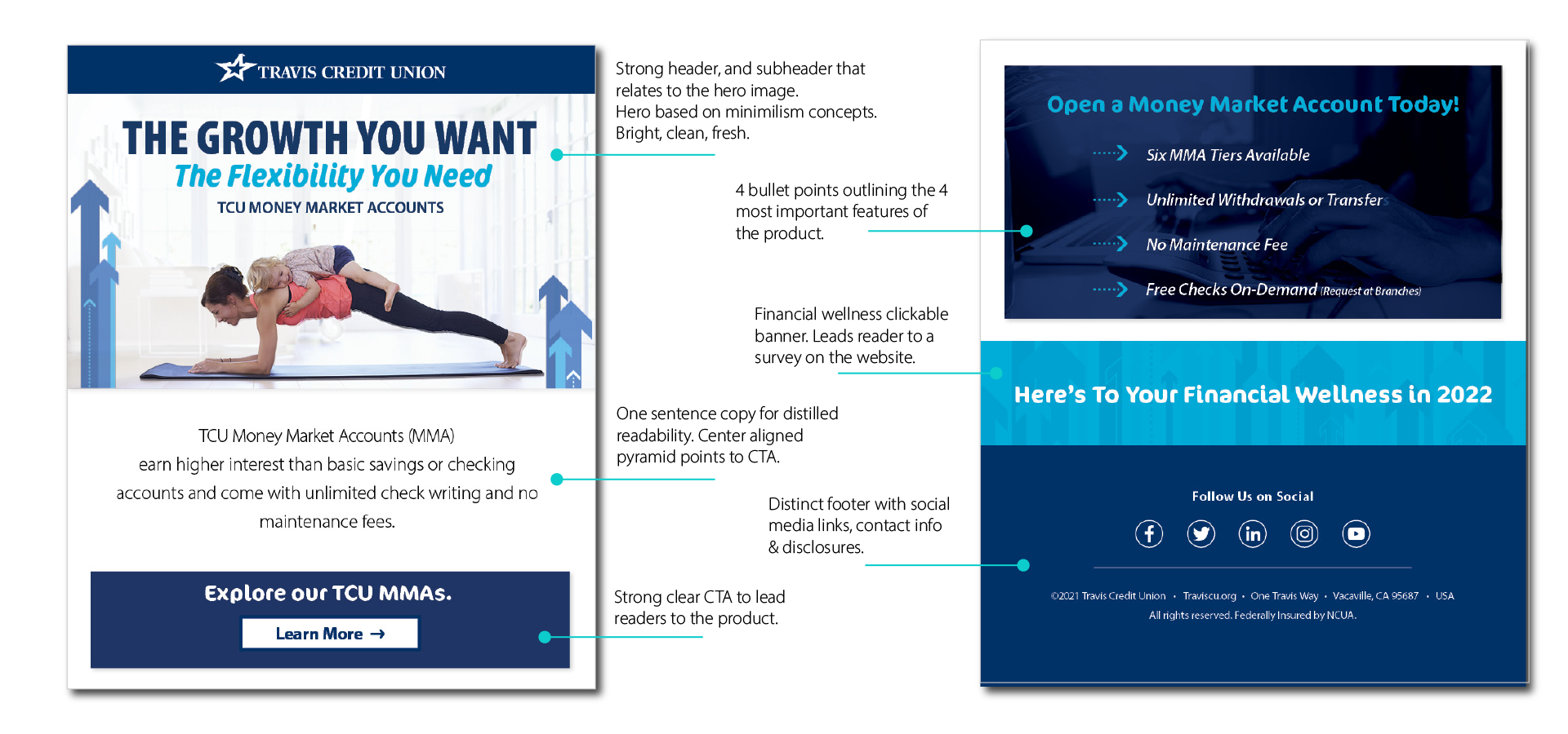
Objective/Audience: To drive awareness of Travis Credit Union MMA suite of products to current members.
Creative Rationale: To drive home that there are a diverse set of money market products available and that “hybrid” products such as MMA’s are a good savings choice with the utilization of lifestyle imagery and creative eye catching text treatments.
Deliverables: All marketing channels including targeted emails, evergreen landing page, branch screens, ATM screens, online banners and social media posts.
Anatomy of the email
Travis Credit Union
Visa Platinum Awareness Campaign Q1 2022
Objective/Audience: To create awareness and penetration of Travis Credit Union Visa Platinum Credit Card to current members with the focus on 3% cash back on balance transfers.
Creative Rationale: To feature the newly updated credit card design as well as the product features of the Platinum Credit Card. Design direction was playful yet clean and fresh with a focus on Millennial and Gen-Z members.
Deliverables: All marketing channels including targeted emails, branch screens, ATM screens, online banners and social media posts.
Anatomy of the email
“Baba Yaga’s House” Passion Project
Illustrated Children’s Book of Russian Folk & Fairy Tales - Summer 2022
Objective/Audience: To share Russian/Slavic/Eastern European folk and Fairy tales for an audience of children ages 6-11. This project was conceived while looking for beautifully illustrated children’s books in English for my own son whose father is Eastern European. I had difficulty finding ones I liked so I decided to make my own.
Creative Rationale: To illustrate a children’s book with original paintings and a dynamic copy layout with bright bold colors and images to help convey the story.
Deliverables: Hard back children’s book size 8.5”x11”.
“Baba Yaga’s House” hardcover.
Baba Yaga and Vasilisa illustrated Book Plates.
The Wolf and Frost Father illustrated Book Plates.
Details
Reading “Baba Yaga’s House”
Wiiwish Family Farms Brand Strategy
Brand Identity and Merchandise - Summer/Fall 2022
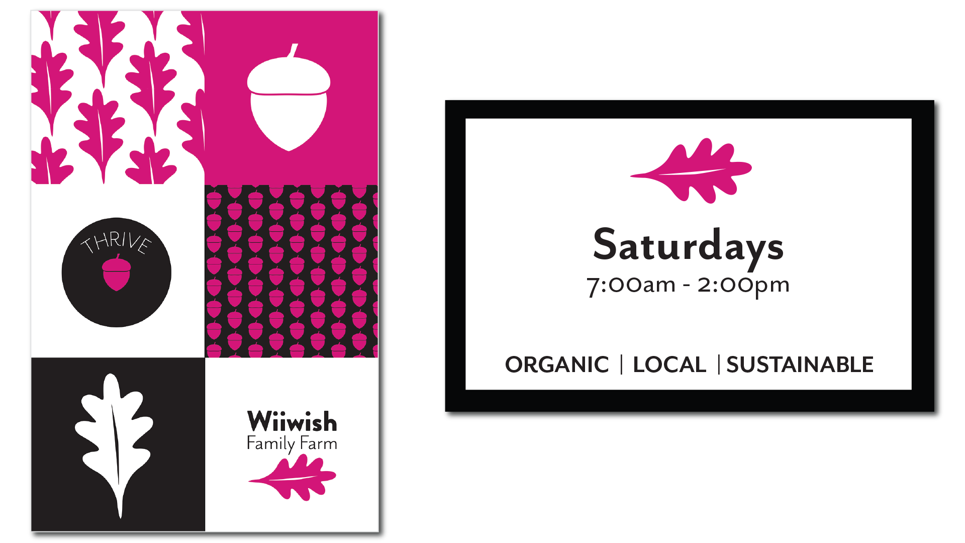
Objective/Audience: To create an entire brand identity, including logo, for “Wiiwish Family Farms”. Partners Jill and Simone had the life long dream of having a micro-organic farm and selling healthy produce at their local farmers market in Davis, California. Having a small grove of mature valley oak trees on their property meant that they had an abundance of acorns each year. After experimenting with creating acorn flour they decided to sell this native food along side their produce. Acknowledging that they are now living on Patwin (the Indigenous people of the area) land they wanted to pay homage and respect by naming their farm “Wiiwish”, the Patwin name for the acorn mush that was once their staple food.
Creative Rationale: Jill and Simone wanted to stand out amongst their peers. Recognizing that most farmers are not designers they noticed that each stand almost blended into the other with the common motifs of cornucopias, leafy greens or chickens as their themes. Being fans of pop and modern art we decided to create something that was clean, fresh and striking. With a color pallet to stand out of black, white and magenta customers are certainly going to turn a head towards Wiiwash family farm.
Deliverables: Logo, booth signage, social media posts, mockups for merchandise and recipe cards.
Logo and Secondary Logotype
Merchandise specific to Farmer’s Markets.
The brand strategy behind the social media posting on Instagram is that every other tile with be a picture and then a quote in magenta. This will have a nice visual tiling effect on social and break up the clutter that most Instagram feeds produce.
Banner and sign for the farmers market booth.
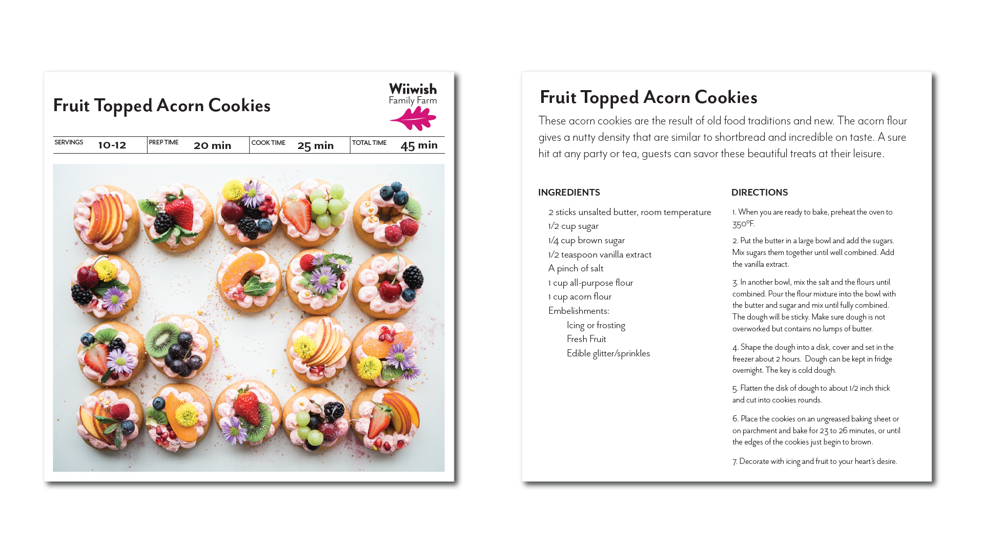
Example of a recipe card that can be presented to customers which feature produce and flour produced on the farm.
UC Davis: Dept. of Astronomy & Physics
Logo Design 2021
Objective/Audience: To create two logos for the acronyms “C3VO” and “ORELSE” which are particular astrological surveys that the astronomers were researching.
Creative Rationale: The client wanted to incorporate the structures of galaxies, light spectrum and star patterns into the logos which were to be displayed on presentations and publications.
Deliverables: Two logos.
Use: As of Spring 2022 the logos have been widely used at the international astronomical conference, press releases, & the UC Davis Physics & Astronomy Weekly Review.
Client Testimonial:
My name is Brian Lemaux and I was formerly a researcher at the University of California, Davis and now a staff scientist at the Gemini-North telescope in Hilo, Hawai’i. I had the pleasure to work with Maya Chalee on a few projects related to astronomical survey of distant galaxies that were being led by the Physics & Astronomy department at UC Davis. The collaboration with Maya was an extremely rewarding and enriching experience for me and my team. Maya listened to our ideas about creating a logo, however silly they were, and patiently taught us about the world of graphic design. She also listened carefully to the science ideas that we wanted to incorporate into our logos and masterfully weaved both our aesthetic ideas and science requirements into the logo. She provided a huge amount of guidance at all stages of the process to shepherd us through, what was for us, unfamiliar territory to create brilliant and gorgeous logos for our surveys. These logos have now been used in several talks at international science meetings. We could not have asked for more!
Pick-n-Pull
Pick-n-Pull Corporate Rebrand 2017
Objective/Audience: To rebrand the corporate logo across the entire company in the United States and Canada.
Creative Rationale: The old logo consisted of a tool clenched hands with a Camaro style car. The company wanted to update and freshen up its’ logo to a more updated car and to remove the hands. The car was based on a common car the Toyota Corolla and the line art was created to suggest the car and tools so as to emphasize the logo type “Pick-n-Pull”.
Deliverables: Updated logo to be extended to all marketing channels including targeted emails, website, promotional materials, digital/social media channels, all physical store signage and letterhead. Logo type used in other deliverables sans the car and tools.
Bee Wise
Bee Wise Product Branding 2015-2016
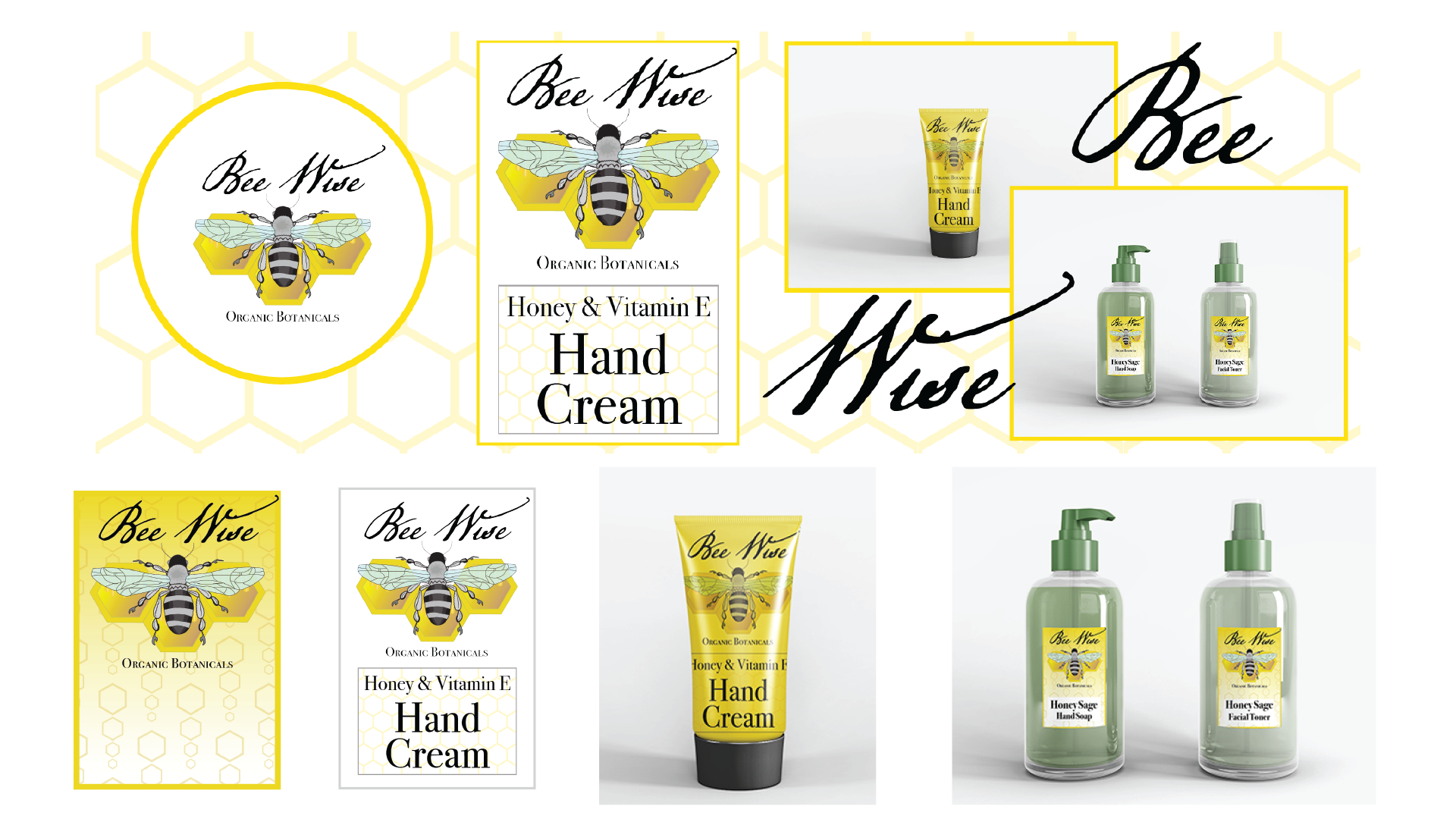
Objective/Audience: To create a logo and branding for a local beauty products artisan who wanted to sell her creams at the local CO-OP in conjunction with my Graphic Design certification through CalArts.
Creative Rationale: The client desired branding to focus on her use of bee products from her bee hives as well as communicate that it was a wise purchase because it was local and organic. The color pallet focused on honey colors and the logo was a honey bee. This was also shown to fellow graphic design students.
Deliverables: Logo and labels.
Logo & Poster Design
Various posters and logos designed while I was a student with CalArts.
